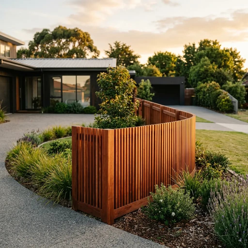
Modern Colorbond
Fence Designs
Six ways to make a Colorbond fence look considered rather than default, and the two that are worth doing on almost any property.
How to make Colorbond look deliberate
A plain sheet Colorbond fence in a standard colour is the default across Melbourne, which is exactly why it reads as default. Three fairly small changes shift it: the finish, what happens at the top, and what happens at the base.
Finish first. Matt in a dark colour, Monument or Basalt in particular, kills the glare that makes a long run of standard Colorbond look industrial. It is the single highest-impact change and it carries only a modest premium on the standard range.
Then the top. A slat or lattice-topped section breaks up the flat plane, lets light through above eye level, and turns a barrier into something with a horizon line. It is the change people notice most.
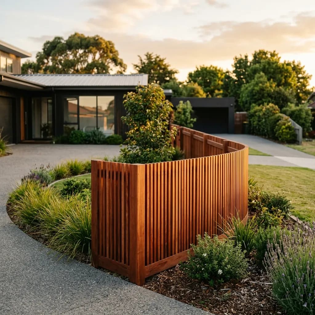
Then the base. A timber plinth or sleeper at ground level grounds the fence visually, stops the sheet sitting in soil, and lets you introduce a second material without a full mixed-material build. It solves an appearance problem and a durability problem at once.
Six designs, and what each does
Each is a change on top of, or instead of, a standard 1.8 metre Colorbond fence. Everything here is buildable on an ordinary residential boundary.
| Design | What it does |
|---|---|
| Matt finish, dark colour | Removes the glare that reads as industrial |
| Metallic finish | Subtle depth in the surface, catches light |
| Slat-top section | Breaks the flat plane, light above eye level |
| Timber plinth at the base | Grounds it visually, stops soil contact |
| Aluminium slat gates | Turns the entry into a feature |
| Full aluminium slat frontage | A screen rather than a fence at the street |
Most of these add a fraction to a standard fence, not a multiple. We price any combination against your run for free.
What is worth it, and where
The same idea can be excellent at the front of a house and a waste of money at the back.
| Boundary | Worth doing | Skip |
|---|---|---|
| Street frontage | Matt finish, slat top, aluminium gate | Nothing. This is the one people see |
| Side boundary, visible from the house | Matt finish, plinth | Slat top, if the neighbour is close |
| Rear boundary | Plinth, for durability | Matt, Metallic, slat tops |
| Courtyard | Slat top for airflow and light | Solid full height, it traps heat |
| Pool surround | Nothing. Compliance sets the spec | Design changes that break the barrier rules |
The single best value decision on most properties is to spend on the boundary you look at and stay plain on the ones you do not. Splitting the treatment costs less than upgrading everything.
Five things that decide whether it works
A Colorbond fence is a long horizontal plane. These are the things that stop it reading as a wall.
Go dark, not light
Dark colours recede and let planting stand in front of them. Light colours advance and make the fence the most prominent thing in the yard. Monument and Basalt are the default choices for a reason.
Break up long runs
A single unbroken run over about fifteen metres reads as a wall regardless of colour. A slat-top section, a change of height, or a planted break all interrupt it.
Introduce a second material
Colorbond against timber or aluminium reads as a design decision. Colorbond alone reads as a budget. A timber plinth is the cheapest way to get that effect.
Think about light
A solid fence around a small courtyard blocks breeze and traps heat. A slat section above eye level keeps privacy where it matters and lets the space breathe.
The gate is the feature
The entry is where people stop and look. An aluminium slat gate in a Colorbond run costs a fraction of upgrading the whole fence and gets most of the visual benefit.
Four things worth knowing before you design
We build these, so this is what we would say if you asked us across the fence line.
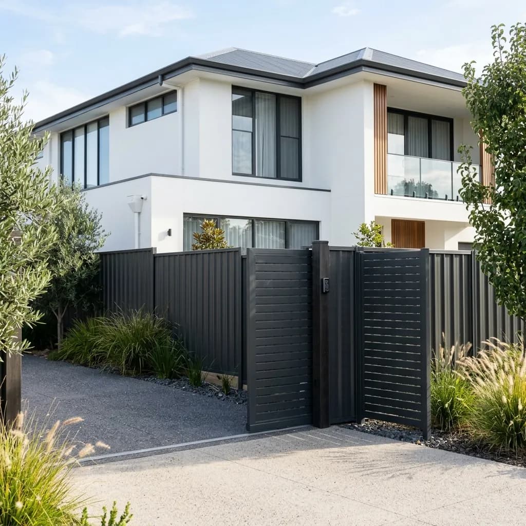
Dark Matt, timber plinth, slat-top at the front
It costs a fraction more than a plain fence, it looks considered from the street, and the plinth means the base is not sitting in dirt.
Finish beats everything else
If you change one thing, change the finish. Matt in a dark colour transforms how a long run reads, for a modest premium on material and no change to the install.
Do not upgrade every boundary
Spend on the frontage and the boundary you see from the house. Stay plain on the rear. It costs far less than a uniform upgrade and nobody notices the difference.
Check before you design
Estate covenants and heritage overlays commonly restrict fence colour and material, particularly at the street. It is worth confirming before you fall in love with a scheme.
The one that pays twice
A timber plinth improves how the fence sits and stops the sheet contacting soil, which is the main cause of early Colorbond rust. It is the rare design choice that also extends the life.
Colorbond design across Melbourne
Bayside
Known for Bayside, Glen Eira and Port Phillip councils.
Colorbond design questions
What people ask when they want a Colorbond fence that does not look like every other one.
Ask us to price a designMonument and Basalt, both dark neutrals. Dark colours recede visually and let planting stand in front of them, where lighter colours make the fence the most prominent thing in the yard.
Related guides
How to Choose a Fence Colour
Picking a colour that suits the house rather than the brochure.
Read more ComparisonColorbond vs Aluminium
Where a slat screen beats a sheet fence.
Read more GuidePool Fence Ideas
Design ideas where compliance sets the constraints.
Read more ComplianceCouncil Fence Rules
Whether a heritage overlay rules out your scheme.
Read more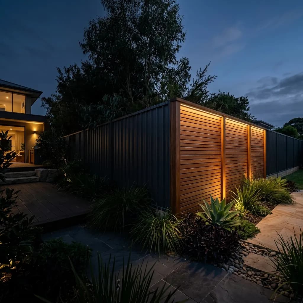
Get a design priced for your boundary
Tell us which boundaries matter and we will quote the upgrades where they are worth it and stay plain where they are not.