How to Choose
a Fence Colour
A fence is the largest single-colour surface in most backyards. Here is a method for choosing one, why dark nearly always wins, and what not to match it to.
A method for choosing
Start from one fact: the fence is probably the largest single-colour surface in your garden. Whatever you choose, there will be a great deal of it, and that changes how colours behave compared with a swatch in your hand.
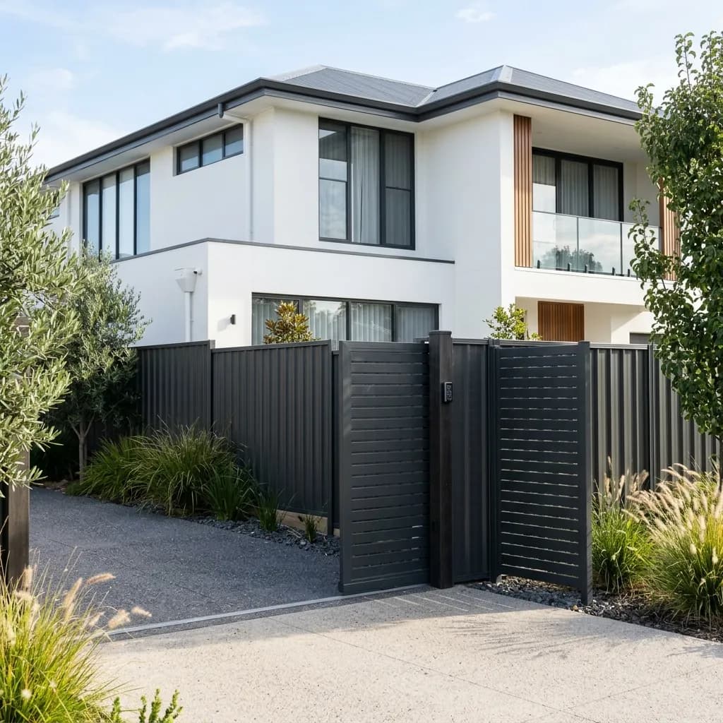
Dark colours recede. Planting reads in front of them, the yard looks deeper, and the fence stops being the thing you notice. Light colours advance, show every mark, and make a small yard feel smaller. That is why Monument and Basalt dominate Melbourne, and it is a sound reason rather than a fashion.
Match the roof and the window frames, not the walls. The fence is a background element like the roof, and matching it to a wall colour usually makes the two compete. If the house has dark frames or a dark roof, the fence has an obvious answer.
And on cost: all fifteen standard Colorbond colours are the same price. Only the Metallic and Matt ranges carry a premium, and Matt is worth considering for a dark colour on a run you actually look at, because it removes the glare.
What tends to work where
Not rules, but the choices that consistently work in Melbourne gardens and the reasoning behind them.
| Situation | Usually works | Why |
|---|---|---|
| Small backyard | Dark neutral | Recedes, making the space read as deeper |
| Large garden with planting | Dark neutral or Matt | Becomes a backdrop the planting sits against |
| Street frontage, modern home | Dark, matched to frames or roof | Reads as part of the architecture |
| Street frontage, period home | Timber, often painted | Colorbond frequently restricted in heritage areas |
| Courtyard with little light | Mid-tone rather than very dark | Very dark can feel oppressive up close |
| Coastal property | Dark, and check the finish | Salt marks show more on lighter colours |
| Next to an existing fence | Match it, or go clearly different | Nearly matching looks like a mistake |
Estate covenants and heritage overlays commonly restrict fence colour, particularly at the street. Check both before committing.
Standard, Metallic and Matt
Every colour in the standard range is treated the same; only the finish genuinely differs. Here is what each one gives you.
| Finish | Worth it? |
|---|---|
| Standard, any of 15 colours | The default. No colour costs more than another |
| Metallic | Subtle depth. Best in sunlight, on a visible run |
| Matt | Kills glare on dark colours. The best upgrade |
Matt carries a modest premium over the standard range. On a boundary you look at daily it is usually the best-value change available.
Five things that settle a colour
Work through these in order and the shortlist usually comes down to two.
How big is the yard?
The smaller the space, the more a light fence closes it in. In a compact courtyard a dark fence genuinely makes the space feel larger, which is counterintuitive until you see it.
What is the roof?
Roof, gutters and window frames are the elements a fence should relate to. They are all background architecture. Matching the wall colour usually makes the fence compete with the house instead.
How much sun does it get?
A dark fence in full afternoon sun radiates heat and, in gloss, glares. Matt solves the glare. If the fence is right beside a seating area, that matters more than the colour name.
What is going in front of it?
If you are planting against the fence, choose the colour that flatters foliage, which is almost always a dark neutral. If nothing is going in front, the fence is the feature and can carry more.
What are the neighbours?
A dividing fence is seen from both sides, and your neighbour has a say under the Fences Act if they are contributing. Raising colour early avoids a disagreement after the order is placed.
Four things worth knowing before you choose
From quoting colour choices across Melbourne for twenty years.
A dark neutral in Matt, and stop thinking about it
It recedes, it flatters planting, it hides marks, and it does not glare. It is the default for good reasons, not for lack of imagination.
Dark is the safe answer
Monument and Basalt are the most common choices in Melbourne because they work almost everywhere. If you are unsure and want to stop thinking about it, that is not a compromise.
Never choose from a brochure
Colour behaves completely differently at scale and in your own light. Get a sample, put it against the fence line, and look at it in the morning and again in the afternoon.
Finish matters more than hue
The difference between gloss and Matt in the same dark colour is more visible on a long run than the difference between two dark colours. Spend on the finish before agonising over the shade.
Do not nearly match
A fence that is close to but not the same as an adjoining fence or the roof reads as an error. Either match it properly or make it clearly and deliberately different.
Colour advice across Melbourne
Bayside
Known for Bayside, Glen Eira and Port Phillip councils.
Monument, followed by Basalt. Both are dark neutrals that recede visually, let planting read in front of them, and relate well to the dark roofs and window frames on most contemporary Melbourne homes.
Related guides
Modern Colorbond Fence Designs
Beyond colour: slat tops, plinths and mixed materials.
Read more GuideHow to Clean a Colorbond Fence
Keeping the colour looking like the colour you chose.
Read more ComplianceCouncil Fence Rules
Where heritage overlays restrict colour and material.
Read more ComparisonColorbond vs Timber
If stain and paint give you a colour range you prefer.
Read more
See the colours against your own yard
We will bring samples to the measure so you are choosing in your own light, against your own house, rather than from a brochure.